 Leticia Sant'AnaLeticia Sant'Ana
Product Design · Kenlo mobile app
Brokers were checking the app constantly to avoid missing critical actions, because notifications were sparse and inconsistent. I mapped a year of research into a notification strategy that helps at the right moments without creating noise.
01 · Context
I led the notification mapping initiative for Kenlo’s real estate CRM, translating fragmented user needs into a clear, scalable notification strategy. By grounding decisions in continuous research and real workflows, we designed a system that supports brokers and managers at critical moments, without creating noise or fatigue.

02 · The problem
Brokers and managers juggle dozens of leads, tasks, and negotiations daily. Yet the app offered limited, inconsistent notifications, forcing users to constantly check the system to avoid missing critical actions. Users needed:
03 · Opportunity
A platform-wide change in engagement metrics created the opportunity to:
04 · Research
Rather than starting from assumptions, I revisited all qualitative research conducted in 2023: full interview transcripts, debrief cards with key insights, and tagged themes across journeys. Using keyword analysis and thematic grouping, I mapped pain points across interactions, properties, clients, schedule, and system-wide behaviors.
Although web and app are the same product, their usage patterns and needs differ, and the app required its own notification logic.

05 · The four pillars
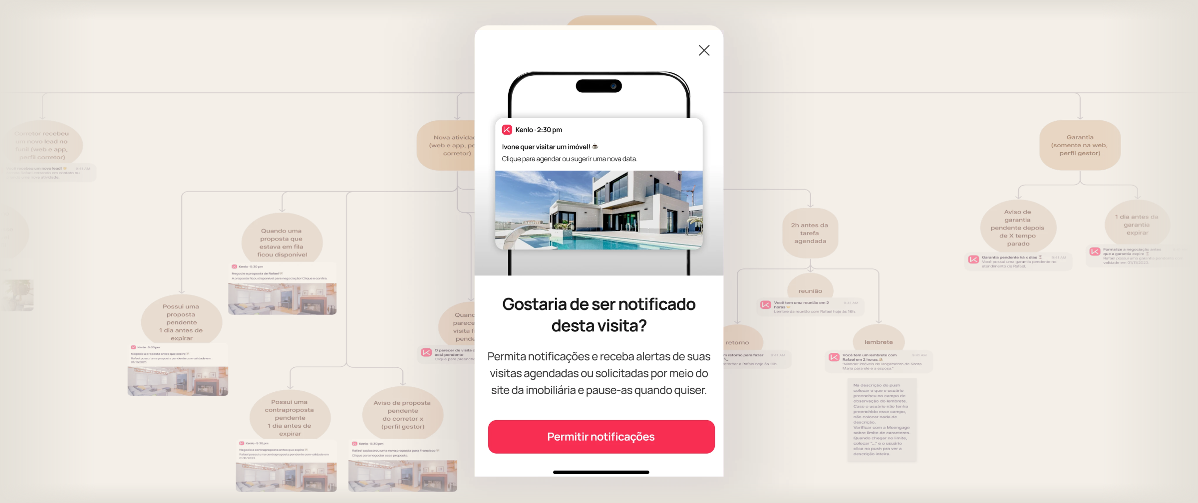
I synthesized findings into jobs to be done, then mapped where notifications could genuinely help. After alignment with the Product Owner and PM, we focused first on the Interactions journey, where urgency and timing matter most. This timeline-based model helped control frequency, preventing notification overload.
Immediate alerts when leads are assigned or transferred. Speed is critical to conversion.
Tasks, visits, and proposals with deadlines or pending actions.
Signals when the guarantee stage needs attention to unblock negotiation.
Notifications supporting signatures and final business closure.
06 · Engagement
To encourage adoption, I designed contextual suggestion moments instead of generic prompts. When users schedule a task, schedule a visit, or receive a new lead with notifications disabled, we surface a gentle bottom-sheet prompt:

07 · Control
Inside the user profile, we introduced a notification preferences screen, allowing users to enable or disable specific notification types and adapt alerts to their role (broker, manager, admin). The UI was designed to scale as new notification categories are introduced beyond interactions.

08 · Next steps
After launch, we plan to:

09 · Takeaways